Adler Planetarium Rebrands
Celebrating its 90th Anniversary
Ninety years in the making, the Adler Planetarium in Chicago unveiled a new brand.
Developed and designed by branding partners, Pause for Thought and The Change Project, the new Adler identity is the culmination of a multi-year transformation aiming to make science more accessible to all citizens of the world.
Max Adler founded the Adler Planetarium in 1930 with the “hope that the youth of our city….may find new interests and fresh inspiration and also that with the aid of the Planetarium, science may be advanced.”
When Michelle Larson took the helm as CEO in 2013, she took this vision to heart and made it her mission to supercharge the experience, and the enthusiasm the entire staff has for inspiring curiosity and connections to the sky. “We are an incubator for inclusive science. We spark curiosity because as humans, we all have a seat at the table.”
The updated brand promise and brand identity was a dream project for the branding partners. “Ryu Mizuno, vice president of marketing at the Adler, came to us with a true story of transformation,” notes Kelli Peterson, founder of The Change Project. “It’s one thing to say you want to connect your entire community to the sky and it’s another to have the ability to do it. The programming inside the Planetarium and deep into the Chicago neighborhoods is like no other.”
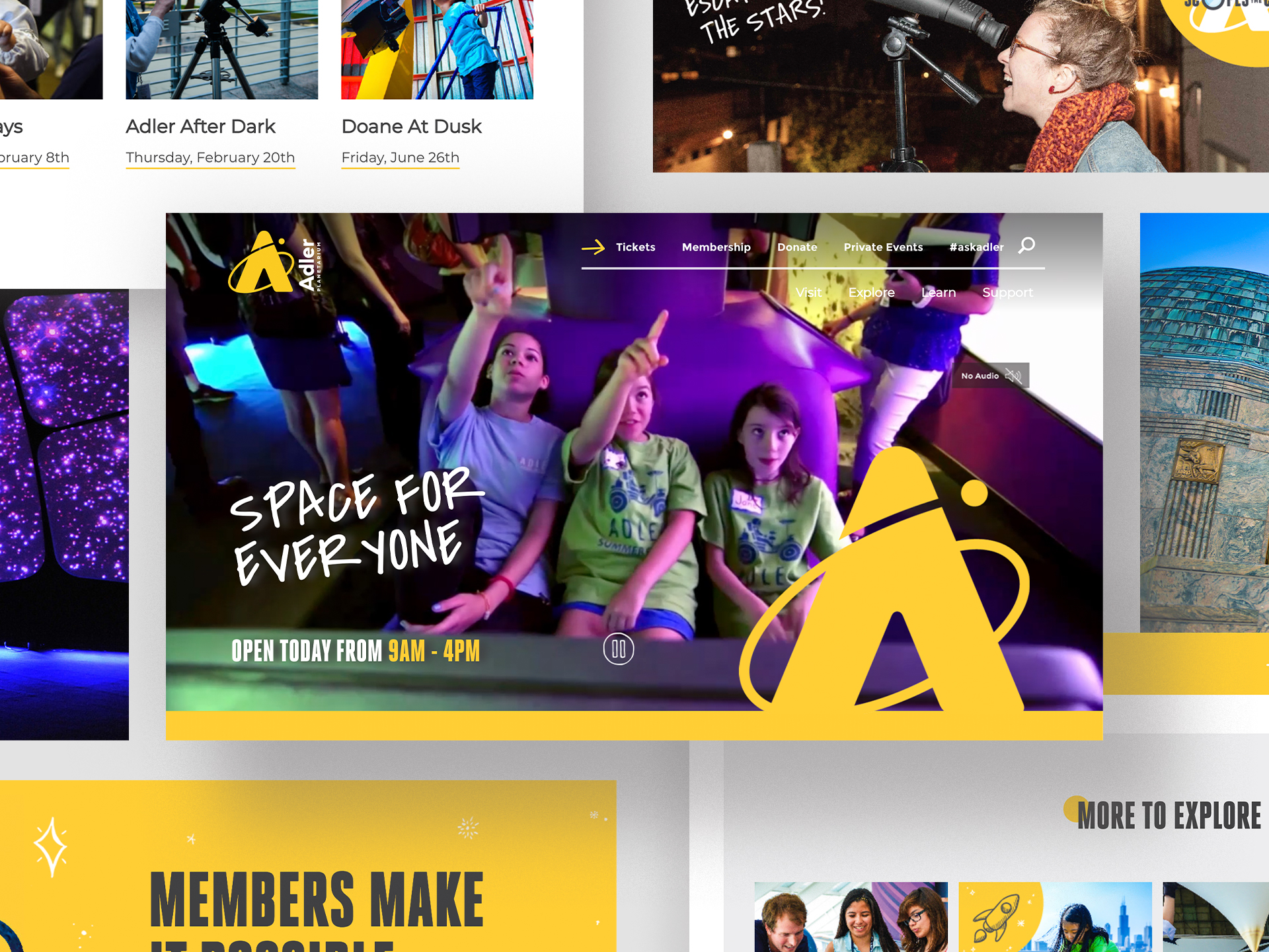
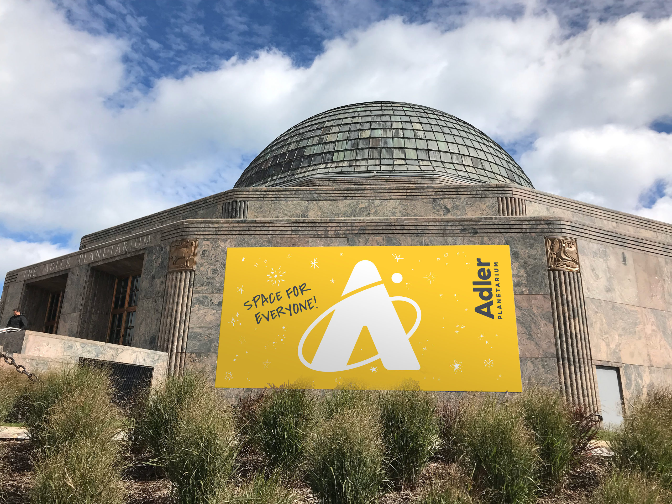
The Adler Planetarium’s new logo took cues from the sky in multiple ways. It now incorporates a warm yellow color — bright, cheerful, and optimistic, much like the Sun. “Early on in the process we established that the logo should not include the dome,” said Janice Pedley, creative director of Pause for Thought. “Although it’s an iconic building, the Adler’s mission is much bigger than the sky shows inside.” The Adler reaches millions through youth STEM programs, neighborhood skywatching events, online citizen science, and other outreach efforts. “We suggested this extensive programming reach could be expressed through the metaphor of an orbit of influence, with Adler at the center. The circular planet is propelled upwards with gravity assist, symbolizing how the Adler inspires people to ’reach for the stars’.”
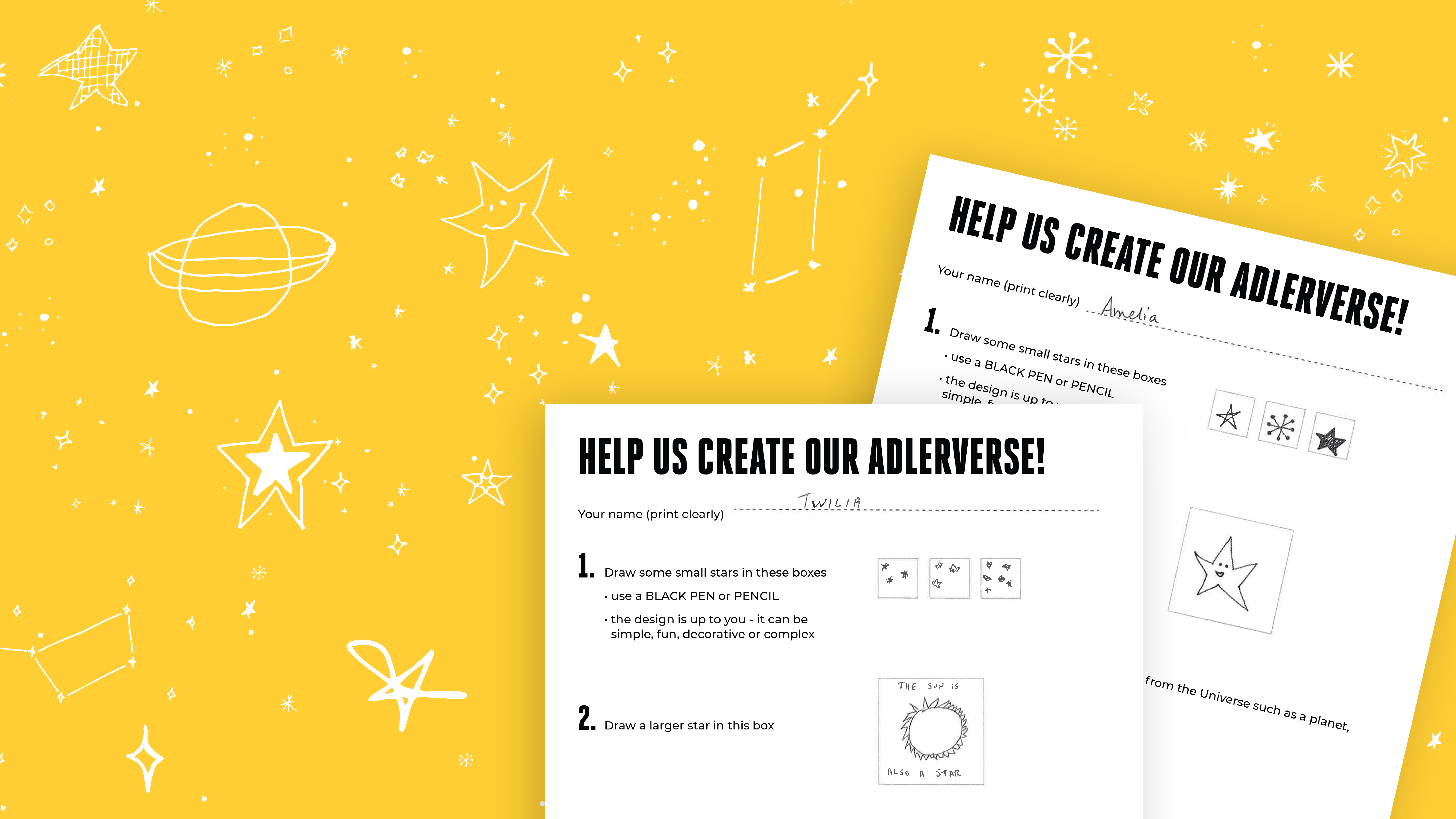
Illustration has a part too and in fact here, the whole Adler team jumped in. “We co-created the ‘Adlerverse’, a collection of hand drawn stars and doodles from the staff and volunteers that is now featured throughout the identity system,.” adds Pedley, “With over a hundred submissions, the Adlerverse is an authentic expression of the whole organization and a celebration of the community.”
The Adler is now realizing Max Adler’s original vision by delivering science for everyone by everyone.